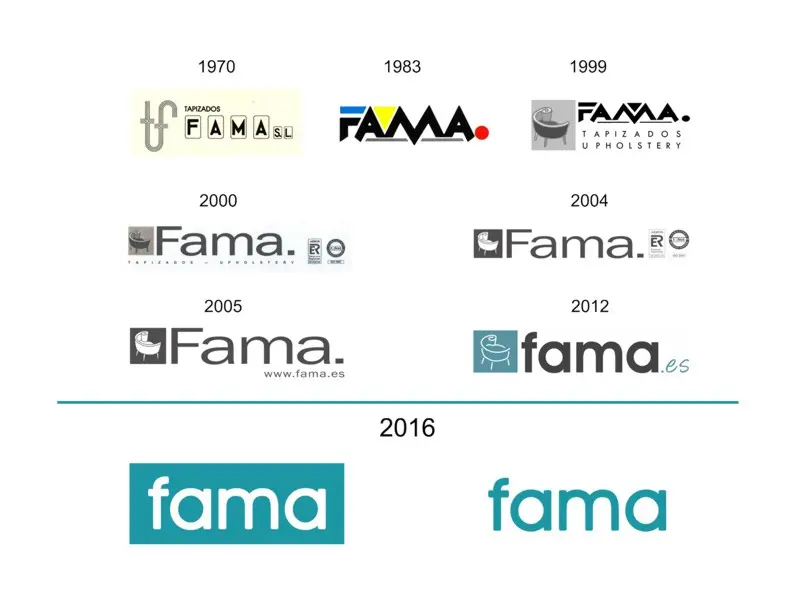
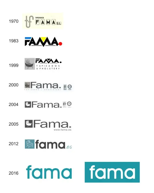
Evolution of the Fama logo.
Fama’s logo has evolved over the years since the company started in the 70's. It is curious to discover the origin of the name Fama, which is due to the initials of the members of the Lopez Gil family: the parents Felix and Magdalena together with their children Aniceto, Antonio, Maria, Francisca and Felix.
Fama's initial logo included a design consisting of the letters T and F, followed by the word Tapizados and Fama letters underlined in rectangles. This first logo included the name of the company with S.L. This logo was in use until 1983, when Felix Lopez Gil joined the company and designed the new logo.
In this second version, the logo only included the name FAMA, with capital letters and straight lines, as well as a few touches of colour. This logo was used for 16 years.
In 1999, "La Caracola" was presented, a design that has become one of Fama's emblems over the years and has been a prologue to the logo for many years. Our charismatic chair has been adapted to the aesthetics of the logo over the years.
In the early 2000s, the logo also included Aenor's quality labels, as we were the first upholstered furniture company to be certified by ISO 9001 and it was important to enhance quality labels.
In 2005, the new website was introduced and this completed the Fama logo, appearing at the bottom right side. Two years later, the turquoise colour was included in the square with a schematic drawing of La Caracola in white. Following the Fama letters, the site www.fama.es has been replaced to make way for the ".es". The Web began to strengthen and its presence in the logo was no longer necessary, so we decided to remove any reference to the Web on the logo.
It was in 2016 when a big change in the design of the logo was undertaken, the letters of Fama were slightly rounded and the turquoise square that included La Caracola was replaced by a mass of turquoise presided over by the white letters, being equally valid the improved version , with the letters of Fama in turquoise on a white background. This latest version has become one of the strongest and most charismatic versions.
Time will tell what the next version will be…


Leave a comment